Tuesday 17 December 2013

Magazine draft


Double page spread image


Here is an image of before and after editing my image - I felt this use of image would be extremely effective for my double page spread as I wanted to use a photo which stood out but also would fill the whole page for my double page spread. The sophisticated dark lipstick on my model stands out and catches the eye of my viewer, as my model looks away from the camera it creates more effect and creates an overall more effective interesting photo. The clothing worn helps create the image of my music magazine - indie pop, whilst the classy eye shadow and dark hair blend together nicely. I used Adobe Photoshop to edit the photo in order to make it look more professional and better on the eye. I wanted to get rid of the dull/grey effect that the original photo had. In order to do this I played with the saturation and the brightness until I was satisfied with the appearance. I also wanted to get rid of the shadows and dark marks on her face, therefore I used the patch tool to lighten these parts. I also used Surface Blur in order to smooth out the image and improve how professional it looked. Overall I believe the outcome of the editing has helped make the photo brighter and clearer for my readers.

Contact sheet


Here is the selection of photos in which I took for my photo-shoot, there is a variety of selection of photos as I wanted the photos to create excitement and be different from the others. Some high angles, mid shots, close ups. As my music genre is indie pop my model dressed to the suitability of this genre and also through the style of photos I took of her facial expressions helped blend in well with my music genre.


Sunday 15 December 2013

Draft Question 7

Back in September when we made our plelimiary tasks it was clear to me during the process of making it that I had no clue how to use indesign or how to arrange a front cover/contents page – I have only been use to Photoshoot before and even that I found challenging so this was a big task for me to take on. In comparison to Photoshop Indesign have a lot more tools and techniques in which you can use to make your magazine more professional and classy.  
 

Indesign is an automatically quicker method of making magazines, there are quick shortcuts you can use to make sure your house style of fonts and colour follow through throughout your whole magazine, you can add swatches and by doing this it saves your chosen colour into a tool bar on the side ensuring you always have your house style colour on the side able to use. As for the fonts you can design your own ‘paragraph’ settings, so whenever you want to make a title the font comes up in the chosen size every time as will subtitles or articles which you chosen. For the images, the quality of them was much better and easier you click in the chosen area choose the picture and it comes through – my overall magazine looking back now is of such a higher quality and design in comparison to my plelimary task where no real house style or design was used. I feel I have learnt an awful amount, before I never new about the short cuts or the different designs you could use which I have learnt about. In comparison to my GCSE work too the change is unreal, It’s made me realise if you know how to work a programme well it will all fall together in itself and look great.
 
 The image quality used in the plelimiary task was not up to a good standard, the back grounding of the photos was just taken in a random place with a non professional camera where as now the photos were taken professionally with a high tech camera using props and thinking clearly about the mise en scene of the magazine.

Saturday 14 December 2013

Draft Question 6


Throughout my experience of this unit of making our magazines I feel as if I have learnt a huge amount from the jump at GCSE level, the professional software we have been introduced too have been a massive benefit towards the final product of our magazine. The benefit I feel I had was the experience of using Photoshop from GCSE level this gave me added information on the software ensuring I felt more confident when making my edits from my Photoshop - however, before I didn’t know the full depth use of the software however this time learned how to turn edits black and white yet change certain features to a natural colour, for example turning an image black and white but making my models lips red. Having the power to change around the colouring and lighting of photos meant dark photos I could bring to life and highlight my models facial features. The patch tool that Photoshop provides gives you a chance to blemish your models face and remove anything on the image in which you feel would make it look un-professional this is a huge benefit when editing close up photos for the front cover and you want the photo to look as clear as possible.

Moving on to the new software I have been using - Indesign. Indesign is a brilliant software when creating your magazine as the tools you are using ensure a professional appearance to your product, my favourite element of the software was the paragraph styles you can use, this allows you to use a specific font, size and colour and repeatedly use it whenever you want meaning the text style will always be the same throughout the magazine helping to hold the professional house style. When making my contents page I found this element of the software particularly helpful, it is important that throughout the contents page everything looks similar and using this tool enabled me to do this, it meant I could create my magazine a lot quicker and ensure no errors. Another benefit of Indesign which I loved was when pressing 'W' and 'shift' you are able to see columns on the magazine highlighting if all the images are on the same line and length this ensured nothing was wonky or unprofessional. When adding your article onto your double page spread I found it particularly easy and quick as you just add the text where you want it to go and click a button and it text wraps the writing around the chosen images for example.

The photos you choose to use in your magazine play a massive role on the final product, however this is dependent on how good the photos are which relies on how good the camera and lighting quality are. The camera that we used to take the images where on a canon camera with a white drop background behind with lighting which went off every time you took an image, ensuring it was easy to edit photos and meant the model stood out in particular for the front cover image where I feel it is important that there is no other detail on an image other than a close up of the model.

Friday 13 December 2013

Draft Question 5

The main way in which i want to attract my audience is through the main images and sell lines that i will use, this is because it is eye grabbing and tells a story to my readers without them having to know my artists full background. My music genre is already a popular high selling genre and to be able to ensure i can contain it sells i want the content inside to be up to a high quality, some magazines don’t bother ensuring the article inside is interesting and exciting because they feel they can rely on the images - this isn’t how i want my magazine to come across. If someone has already purchased your magazine due to the exciting front cover displaying famous artists and exciting sell lines the article will only ensure the readers carry on buying the magazine. The bold title in an italic funky font backed up with the bright turquiose blue with crystal white colours ensures catching the attention of my readers.
 
I can ensure my magazine will sell to my readers as there are several different ways in which they are able to purchase it, my online website which they can go through articles online and be interactive with the magazine, through social media twitter and facebook and being able to subscribe each month with the magazine, this all helps to ensure a sell of the magazine through the wide variety of ways in which they can access it. Social media is the key to success in today’s industry - the high demand on the media which teenagers hold, most teenagers don’t have the money to buy magazines and therefore rely on the media to access information which my magazine holds. The reason why my magazine holds such a unique and original feel to it is because of the detail and thought which has been put into the website, rather than spending all time making so many final details to the print magazine so that i can focus time on ensuring the online website provides just as much detail and excitement.
 
  My front cover is powered by the extremely interesting close up of my model Ella, the bright lip stick and classy make up brings a unique and interesting appearance to the magazine, this helps widen the amount of readers my magazine has. Clearly this would appeal to female readers as it is a role model women who they may choose to look up to but also male readers as it could appeal to be quite sexy to them.
 
The front cover expresses a quote in which Ella states during the article, being the most overwhelming quote it will help to give my readers as inside view to what’s going to be in the article. Listing some of the most well known artist in the music genre down the side of the magazine front cover with a sell line of how they will be involved in the magazine will also help ensure sells of my magazine - this is because some readers may not want to read the magazine for what it is but are massive fans of Rihanna for example and therefore will want to purchase the magazine to read about her. 
  
The contents page is focused on expressing what the magazine is involved in, giving inside information to the topics that are in my magazine. Subtitles of gigs/festivals, features and regulars - this gives the article title to the reader without them having to flick through the whole magazine to what they’re looking for, ensuring they find the article they want get the page number and can go straight to that page. The list of all the artists involved on the side demonstrates the Varity of famous music artists that are involved in my magazine increasing the amount of people who want to invest in my magazine, as it gives my reader a good feel to the magazine as such a large amount of artist are willing to be involved in it. The wide choice of images used on the contents page ensures the good appearance and interest of the magazine.


Backstage of my Photoshoot

 
Yesterday I had my photo-shoot, I used Ella Noonan as my model as I feel she is a good representation of my music genre - urban pop. Ella will be my main model and I will use her for my front cover, double spread and some smaller images on my contents page, I feel my magazine was successful as I have gathered together a variety of photos which represent different camera angles and positions of my model, some of her looking away from the camera some laying down some sitting down, all of this will create effect in my final piece of magazine. My model changed what she was wearing several times ensuring creating effect, a change of lipstick colours and hair styles meant creating an effective use of individual photos.


Behind the scenes - Video


Thursday 12 December 2013

Draft Question 4

My audience is aimed at teenage girls aged 14-18 however I have tried using different techniques within the magazine to widen my audience to teenage boys too. The reasoning for my choice of age group of 14-18 is any younger I believe wont be able to afford my magazine, it is unlikely 13 year olds get pocket money every  week and are able to get themselves to the shop to purchase my magazine which is my main reasoning for starting the age group from 14, you may argue 18 year olds are too old to buy magazines but a massive part of my magazine is about winning concert tickets and talking about gig guides – you have to be 16 and over to be able to go to concerts and at this age concerts and gigs are a key to a teenagers summer and a chance of winning free tickets I know will be very  appealing to them. My music genre is indie and pop and therefore could have both female and male genders follow up on my magazine – due to the high amount of famous music artist too which both genders would listen too my magazine in this prospect could be open up to both genders. However, due to the vast amount of images being girls and the context of the article being about Ella becoming famous it would suggest that more females are likely to be interested in my magazine.
 
 The social class of my audience will be ABC1 – I don’t want to base my social class on group A only as then people from lower social classes wont be able to afford my magazine weekly, being this social class means I can attract people from a higher social class but also from the working class and higher incoming workers as the cost of my magazine costs £2.70 a week people need to be able to afford it but also actually take an interest in music itself, and this tends to be the social class in which does.  If the pricing is too low it may come across to my audience that my magazine is of a low profession and that there is a lack of detail to the magazine so pricing it right in the middle would suggest that it isn’t too expensive but still is off a high quality.

  The social habits of my target audience who I aim to target for my magazine are teenagers who go out quite often and have part time jobs, those who keep up with checking up on their favourite music artists and enjoy going to gigs and concerts. Due to the aspect that my magazine costs £2.70 my target audience need to have the social habits of being out and being involved - my typical reader would be a teenage girl who lives in Camden, goes out often with her close friends shopping and going out for meals, earning £150 a month from her Saturday job and always keeps up with her favourite celebs on her iPhone.

Wednesday 11 December 2013

Draft Question 3

It is very important that a company distributes my magazine - however it is more important that the company distributing my magazine doesn't already have of a similar magazine as the competition within this music genre category is too high for competition. I would choose for PLC to distribute my magazine as IPC media distributes massive branding of magazines such as Q and NME - due to the massive similarities of magazines from mine and Q magazine I want to keep away from IPC media as the competition would probably out go my magazine due to such high demand of readership for Q magazine.

Future PLC seem a positive investment for my magazine, not only the high demand of readers do they share but have been named 'digital publisher of the year' and 'media company of the year' suggesting the great success in which the company clearly hold. Due to such the high reputation in which they hold I feel confident my magazine would sell well within Future PLC. From information gathered about them they have no similar magazines out right now which they are distributing putting my magazine top ranking for my audience to get involved in. Future has one of the most highly-respected music portfolios in the world and continue to lead the market through print and digital innovation as they look to target more musicians on a global scale. Magazines which they distribute are Total Guitar, Rhythm and Guitarist. The company will hopefully like my magazine as they should feel engaged through the sense of similarity, as instruments play a role in my magazine both indie and pop music highlights the importance of instruments throughout the music which my genre tells.  In my opinion when choosing on a distributor for your magazine it is important that your target audience is of a similar type, if a distributor was aiming at 40 year olds that would be convenient for my age category however Future PLC have a target audience of 16+ and therefore would not be risk taking when choosing them for my distributor, my magazine would fit in well with the other magazines of what they distribute through the age category of my magazine - as Future PLC has a target audience rating for higher readership of men I need to ensure a good balance for my magazine to ensure I can still reach out to the female readership which I feel strongly about completing as the high demand of readers for my music genre that I have. My magazine will be half print and half online due to the huge platform of Future PLC having of successful online I also feel confident that my online will sell just as well as my print.


Tuesday 10 December 2013

Draft Question 2

My magazine represents the social group of teenagers, the music genre of ‘pop’ and ‘indie’ is most listened too by this social group which is the main reason for choosing it. My magazine is aimed at the social class ABC1, which is a very wide audience, however it means that it attracts mostly middle-class people who are interested in attending gigs and festivals and also love reading and getting involved with their favorite artists and bands. I have tried to attract this social class by the use of my model and her surroundings, props and costumes as I have been able to create a story of model through the representations I have created of her.

Within my music genre I have famous well known artists across the world with name titles such as Rihanna, Eminem, Ellie Golding and Arctic Monkeys the reasoning why I believe its so important to have a strong group of well known artists involved in your magazine as it widens your target audience range. If fans of these artists know they are being featured in your magazine it widens the likely hood of them investing into your magazine. The way you represent your artists through their appearance and facial expressions also help to represent the particular social – the make up my model Ella wears is a vibrant dark purple lip stick and red, these colors signify a classy yet unique person. The clothing in which you wear should also signify your audience as it tells a story about a person and the genre of music they listen too, the stereotype of what they wear gives an impression off about a person. For my music genre it would stereotype that you would wear typical ‘hipster’ clothing – in this my model wears clothes such as denim jackets, dresses with the collar showing over, funky bright colored jackets and a range of boots and trainers creating an ideal stereotype of the typical girl who listens to this type of music.

Facial expressions are also key, they help to tell a story about the character you’re writing about and also express their views in the faces they pull – my model Ella uses a variety of facial expressions to ensure keeping my magazine interesting and exciting – almost like not knowing what’s coming next. The use of looking away photos, to smiling, from looking up to Ella seeing her looking down on the camera to photos which are close ups where my model doesn’t even need to pose for the camera as her own facial expression tells its own story.  The mise en scene in magazines is so important if you want to represent your social class within the magazine – you cant put a 40 year old woman on a pop magazine dressed in baggy trousers and a vest and expect your social group of 18 year olds are going to be able to engage in the magazine. By using a Varity of clothing and facial expressions I have been able to reach out to a wider Varity of people. Rather than just using the same facial expressions repeatedly mixing them up has shown my magazine has more than one side to it rather than just being boring and plain.

Props used play a big role in appealing to my target audience, I want them to see through the use of props what type of magazine mine is. In the smaller images on my contents page and double page spread I have used props such as a microphone and a stall, this helps to create the whole music theme of magazine and suggest the genre being indie and pop and these use of props and generally found in this genre of music.

My front cover speaks for itself, an extreme close up of my model suggesting a unique and classy facial expression yet an unknown face wearing dark purple lipstick backed up with big hair and sophisticated make up helping to attract my target audience through the use of the bold photo.  It is important your readership feel like they have a relationship with the artist which is why using close ups help to do this – from a viewers perspective its almost like you’re seeing into their lives.  If my reader feels like they have a relationship with my artist then they can begin to use them as a role model which is the whole idea in which I want for my magazine – using less smiling facial expressions and more faces which look like they’re is a untold story behind will help create uncertainty between the artist and reader.

It is important to keep up a general house style throughout the magazine to ensure a professional look. Using colors of a turquoise blue black and white as these colors are the most associated with pop and indie music. I don’t want my magazine to be full of blacks and blue as I can feel the black comes across as a heavy and angry color that’s why adding white throughout the magazine shows the innocence to the magazine.

Monday 9 December 2013

Draft Question 1

At the start of this task I had a rough idea of what form I wanted my magazine to have but the ideas where limited, in order to help gather some ideas together I began conducting some research on other magazines with the same music genre – doing this I looked at magazines such as Q magazine however I found the best form of research on magazines was looking at students as I felt this would give a better idea of what is realistic that I could produce and here I got an idea that I wanted to use a blue turquoise colour theme and I wanted the music genre to pop/indie. I wanted my magazine to look professional and not full of tack, something in which the Q magazine brand follows, this was a good guide line for me while producing my magazine.
 
Using a close up shot of my model Ella for my front cover was used for my front cover, all successful magazines such as Q always use close ups and always come out the most effective. I believe it helps create a personal relationship between both the model and the reader due to the aspect that an extreme close up helps enable to tell a story about the person, drawing attention to my magazine on the shelves. I believe close ups are the most professional and classy approach to the front cover main image. Moving on to the masthead used the bold font in my house style themed colour turquoise blue, it stands out through the increased size of it not only did I want my masthead to stand out being big but I wanted the font to tell a story itself about the type of music genre my magazine is, I feel I done this well.
 
Moving on to the house style used, colours of white black and turquoise blue. I knew I wanted to include the basic colours of white and black as, as boring and frequently used they may be they stand out over many other colours and are a nice colour to mix with your main colour. My main colour of turquoise blue I choose due to the fact I felt it went so well with my music genre, when you think of the colour you would associate it with hipsters. I named my magazine ‘radar’ as I felt it was a name which would catch people’s eye and signified the genre of my magazine. The masthead itself followed the house style of blue while the slogans around it where white and black which I believed outlined the importance of the masthead. Sell lines play a huge importance on a front cover, they give away cheeky lines about the insight to the magazine and also determine a sell of the magazine, if someone likes the look of the magazines front cover there is a higher chance of them purchasing. Including the main quote of my article on my front cover above introducing my model Ella this helped to introduce the article and what my main story line would be about. After researching into magazines similar to mine it was obvious including a list of artist that where being featured in my magazine would be a key aspect to success, evidently audiences of this genre were interested in hearing gossip about a lot more than one artist.
 
 Throughout my contents page I want to demonstrate the conventions of real media products, I have been able to do this through the way in which I express a large number of artists on the side of the page - this would suggest to the audience the genre of my magazine whilst attract a wider audience through demonstrating well known artists. Whilst engaging my readers to get involved through subscribing online I am demonstrating to my audience i have understood their needs from the print industry as due to my target audience not wanting to go out every week purchasing the product they have the opportunity to still be involved within my magazine whilst not having to make any effort - this helps to balance the users of online and print. Although still promoting twitter/facebook on my contents page to ensure my audience know i have met the needs of the teenage market. Throughout my contents page i have ensured sticking to the same house style of turquoise blue with the same fonts and sizes throughout keeping the appearance professional.

The start of my double page spread stars in promoting the artist herself to the magazine, an extreme close up helps to create emotion and suspense - the image itself can create enough for a viewer to want to read about it, if you feel connected to the artist its likely you’re going to be more interested in the magazine and get involved in the article. Whilst the main image takes up the whole page a small section in the corner starts the magazines article off, highlighting key words from the quote describing the most dramatic words. Most successful magazines such as Q use this style of double page spread to introduce the artist as a sense of importance of them.


Saturday 30 November 2013

Equipment

InDesign
 
I am using InDesign to make my magazine, it is a quick and efficient way of making my magazine and much more professional in comparison to Photoshop - it enables you to use quick shortcuts while making my magazine. You are able to text wrap text quick and easy where as in Photoshop you had to draw it to go around the images. You’re able to create more effective shapes and text on this software, you can copy anything and place it in the exact same place without having to re-make the shape - InDesign. When importing photos all you have to do is drag the photo over into the place you want it to hold and it will go there, very simple and easy.


Cameras/Photoshoot

In order to create professional looking photos I’ve done a photo shoot of my model Ella, using the white backdrop and lighting on her face I am able to create unique professional photos. Using the cannon 550D - having an extra zoom lenses you are able to take close ups, mid shots and full length photos of my model creating a wide variety of photos ensuring the quality of photos is high. If the camera quality was poor on my magazine it would give a cheap and tacky feel to my magazine and wouldn’t appeal to my target audience of teenagers.


Photoshop
 
Once taking my photos I want the photos to stand out and be more effective than before, this is where Photoshop comes in to it. Photoshop allows you to edit photos enhancing them and air brush their face to give a glow and bring light to the face. You are able to do some great things on Photoshop transforming a face which may have damaged skin to looking like they have had a professional make over. I want my images to stand out on my magazine by being able to air brush my models face means i can make her stand out even more than before creating an effective front cover for my magazine.
 

Saturday 23 November 2013

Box out text


I will have box texts with other artists giving them their view of the music industry and ensuring there is more variety in my magazine and giving my viewers more choice of artists, this may also mean I gain a wider target audience.

Recommendations check out Miley Cyrus and Bastille for their inside opinion on how they’ve got to where they are today in the music industry.
 
Miley Cyrus – Being a 21 year old and going through the shit I’ve gone through is quite a lot to take on board. From staring in the TV series ‘Hannah Montana’ to going being in massive films across the world to now being one of the most crazy and outgoing female artists is quite a big jump in my life, I get told I’ve changed more than once a day but it’s not that I’ve changed its that I’ve finally become myself – music brings out who I am and this is who I am. You write lyrics to tell a story, this is mine.

Bastille – Were an English rock band which formed in London in 2010, we began as a solo project where Dan Smith the singer-songwriter started off who later decided to form a band – we write music about our life experiences and emotions something in which very little groups do.

For one of my ‘box out’ texts it will be based about my artist, Ella Noonan. This will be called ‘Article with Ella’ this will help my readers get an insight to my artist and help my readers feel connected to my artist. For the readers who may not choose to read the article they are able to have a short summary of the main artist to get some background knowledge of her as it will also break up the page from information just being about my artist in order to make the magazine double page spread more interesting to engage in.  

Ella Noonan
21 years old
Singer-songwriter
London
“I aspire to be nothing but myself, I’m not here for the fame even though it’s a plus – I just want to do what I love best, make music.”
"I want to stick two fingers up at all those people who said id get nowhere, whos laughing now bitches"
 
I think including a box out text profile on my main artist Ella will help engage my readers to my magazine making them feel apart of them magazine creating a personal relationship between them both - as the article gives little information about her the box out text will give that added information so my readers know everything there is to know about my star.
 

Tuesday 19 November 2013

Media article


Some people are born just naturally talented, beautiful, clever and rich but some people work to be every single one of them. They aspire to be something and they fight for that goal until they achieve that, I put my hands up and say Ella Noonan is one of the most apprising and ambitious woman I have ever come across, from starting at the bottom she has come on top higher than what anyone thought was achievable. Being brought up by her teen mum in an estate in London living off benefits and having to defend for herself from such a young age, not knowing what ‘make up’ or ‘toys’ where, having nothing to make her feel worthy of who she was is something no person should go through. You think that’s fair? You’d think having nothing would just put you down and make you want to carry on that circle of being nothing for your life. Not Ella however, oh no.

She’s on the top, she’s an aspiring music artist and fashion model with 3 number 1’s in England and America – her album ‘bang’ sold all throughout the world, her face on thousands of records singing all over the world conveying her determination and inspiration that nothing should let you down. “being at the bottom taught me to only fight for what you want to be, never sit back and let the world pass by you.” Ella began her journey at a local school in London - East High, where she was part of the school choir “I never felt more myself than when I was on that stage singing my heart out” she would regularly sneak out of home to go to the choir as her single mum was never really a fan of that type of music and thought Ella was just chatting shit when she claimed she could sing. She done well at school despite everything and game out with 6 A’s and an A* in music she followed her passion despite no one around her believing in her talent and studied music as an a level coming out with an A “if my mum believed in me and my passion maybe I would feel like I was worthy of making something of my life” the lack of family support only pushed Ella to wanting her mum to know about her talent even more – she was determined to prove to everyone she could make it big. Well what did she do!

“I wasn’t a popular teenager” she quoted “People thought I was a bit weird and I just apparently wasn’t popular enough for their fucking group ironic because all they gave a shit about doing was being with boys and begging for attention, sluts” Ella performed in various bars and gigs before being noticed by David Warton who offered her a record deal with him being his manager, not only was this the biggest opportunity of Ellas life but is manager of stars such as Rihanna, Ellie Goulding and Drake “you know when you’re past happy that you feel like you’re in a dream” This would land Ella with some of the biggest deals and paths to becoming the best, when you have good links that’s when you begin to come big in the music industry. Within a few days Ella was being published all over the faces of magazines such as ‘OK’ and was trending worldwide on social media website ‘twitter’ Ella was becoming a star overnight. “I just kind of woke up one morning and my whole life had changed, I was being rung being told I had meetings with more managers in London, people wanted to interview me. Literally David had changed my life over one night, I’ve never had anyone believe in me as much as he did – he’s the reason I am where I am now.”

Ella knows she’s not that type of girly girly to get glammed up and look after herself like she should, just the way she’s been brung up I suppose. I mean imagine never having your hair curled or having your own make up bag? Words can’t describe. David called an urgent meeting with Ella to discuss the next step of action to take, meeting in a nice civilized restaurant in Chelsea Ella and David discussed her future –the bright blue sky in the background while enjoying the delightful selection of lunch snacks Ella expressed “I’ve never been this happy in my whole life, I didn’t even know what happiness was until now” David knew Ellas background and didn’t want her to feel that because she has had nothing means she can’t have everything now. “I’ve been in same place as you, feeling like no one cares and you’re just this pathetic excuse of a person but really its people like us who fight for everything we want. You will be a star fuck what anyone else says”

Ellas next step in her career was to get a record deal allowing her to publish the song in which she wrote herself, something in which no other star has in the charts is the passion in which Ella has – writing their pain through their music and expressing true emotions that they’re going through “I’m not about that bullshitted music where you just talk a load of shit so it sounds good, my music tells a story – it tells me” The charts is filled with this load of music which just talks shit, people doing drugs and how great it is and the amazing life of ‘clubbing’ what sort of artist are you to convey drugs and alcohol as a good thing? What are you promoting to this world? “I'd much rather express through my songs the real problems of society like war and lack of money throughout familys and the struggles of life let’s get real, let’s start talking about real fucking problems – drugs aint no issue unless you bring it upon yourself.” Life is filled with this idea that music artists are the reason for the way society is, the reason why kids act the way they do and sometimes you can’t but not agree. Music should be a way for people to engage with the artist and have them as a role model, a person who has achieved high in their life and therefore should form a personal relationship with them. “Music tells a story whatever story you confess, people create that image of you”

Today was the day Ella was going to start producing her music video, director Paul Smith was leading the shoot and all the cast where so excited to get this music video going. Music publishers all over London and America where getting in contact with her manager David - this was Ella’s big day, the day her album 'bang' was finally going to have an aspiring music video for all her top fans to be involved in. The day was to begin with a photo shoot, dressed up like the hipster chick Ella is she was ready to get stunting for the camera. Dressed in a funky jacket with bright red lips and a big gold chain she was determined to show through her persoanlity in this video, as a new artist it is important to give the best impression as after all first impressions count the most. "Im so nervous, I mean from being a little girl watching music videos to actually being the star who little girls watch" Once the creation of the video began to make process everything started coming together - the background dancers finally found their feet and Ella started getting into the presence.

"Ever since becoming 'famous' I feel as if my every move is being watched and judged - even buying a sandwich the press perveve to be 'wrong' in magazines" Being famous isnt just about doing what you do best but its about creating headlines and storys for people to talk about, its about being an interesting individual to ensure creating gossip for those who follow up on you. Imagine no celebirtys done anything outragous or dramatic, how boring would it be? No gossip in magazines, no dramatic tweets over twitter - it would just be dead. Manager David promts Ella on this topic, reminding her about the competitive industry and that to stay on top you have to do something on top of everyone else, anyone else would take this as such that maybe you should sleep with a guy or some shit like that but this isnt always the case. 3 months down the line since manager David pep talk and headlines world wide discuss 'ELLA NOONAN DRUG ADDICT' this was a turn for the worst - everything Ella has worked for could be blown away in seconds, discussions on TV, twitter, newspapers and even day to day convosations spoke of her drug problem "what does david expect? dont put this pressure on me to do something crazy then question me for taking drugs the pathetic prick"

18th November, nearly christmas. The happiest time of the year for most people, why does it seem like its the worst time of the year for pop star Ella? I suppose if you found out your daughter was on drugs you'd feel the same ay? After Ellas best attempts of proving everyone wrong its like shes fallen back to rock bottom "I had it all and now I feel like im nothing" Drugs effects everyone, ironoic that Ella claimed shed never allow herself to get this way though "I know its my fault and I have noone to blame but I just thought it would help the pain" Depression is common in celebritys, drugs is common, affairs is common but why isit that those we look up to most are those who are destroying their lives and everyones around them? Role models shouldnt be these kinds of people, Ella claimed she'd never become one of these but clearly the fame went to her head too.

"I dont care what anyone says or thinks I will prove everyone wrong, and when I do.. HA" David and Ella sat down and had the convosation every manager fears to have with their artist, the question of will this work? How can I trust you? Will you change? Who knows what was said in that meeting but Ella came fighting harder than ever. "I was nothing, I became something then I went to that sad place again but now im going to become more than something im doing me" Fighting on Ella and David went down to kiss fm radio station to do a live talk, live on air sending her biggest apoligys to the fans which shes let down recently and begging for forgivness. Trending worldwide on twitter withing 5 minutes of Ella's speach #WeLoveYouElla - who knows what media can do but it clearly helped Ella in this case! She new it was her last chance, she wanted to make it big and now she cannot let that chance slip out of her fingers.

Ella didnt have a big family support at a young age, being brung up by a young mum with no father around isnt exactly 'easy' for anyone, however after proving to everyone what she can do she has brung everyone closer. Family from all over the world getting in contact with Ella and her mum offering family support and help if needed, the happiness that Ellas mum, Linda was feeling was unreal "seeing my mum this happy is my key to carrying on, she deserves the world and thats what I want to give her" Ellas dad who never got in contact before is emailing her from Liverpool telling her how proud he is "I always said music is the key to love and happiness and look what it's done now."


Cover lines


Tuesday 12 November 2013

Contens Page Ideas


I have gathered together some ideas of article titles/subtitles I may use in my magazine, gathering an idea of the types of articles I want to include. Firstly I listed the music artists I want to use in my magazine representing the genre of music I am displaying - I researched some background information into my artists in order for me to be able to summarise them in a quick and catchy subtitle for my contents page. I don’t want my articles to just be about celebrities so I have included a variety of different topics, some being based on gigs/concerts and others about other parts of the music industry which has helped formed my music genre. The Brit Awards was a massive part of my music genre - I’ve included some short and snappy slogans to use in my contents page to grab the attention of the fact I will include the Brit Awards in my magazine.


Monday 11 November 2013

Draft layout/Magazine


For me to be able to create my magazine I have created a draft idea of my magazine on Indesign, this will enable me to just drag in my photos/text when it comes too making my magazine - this is a quick and efficient way of making my magazine and ensuring it keeps a professional feel to it.


Thursday 7 November 2013

4th Novemeber/Production diary


In today’s lesson we began to make the layouts for our magazines, by doing this we would place boxes in the places in which we want an image/text to go and this would begin to indicate to us what our magazines will look like as when it comes to finalising the magazine all that will be needed to do is to drag in our images/text. This is a quick and efficient way of getting our magazines completed.


Monday 4 November 2013

Promotional Methods

Promotional methods is an important aspect of gaining a target audience, it is the best way of getting information out to a wide audience – as my magazines target audience is teenagers I would need to ensure I use the correct form of promotion methods – the underground and bus stops for example.

A way of promoting my magazine can be through public transport. Busses are a form of transport which take you around you’re area for free, this is the most fertile form of travel for teenagers. On a day trip out at least 10 buses will go past you - there is no way that you can miss them, including buses as a use of my promotional method will ensure I reach out to a wide audience by attracting them to my magazine. Going on buses itself they are forced to see the advertisement buses represent, this is why I will use buses for a way of promoting my magazine. Everyone looks out for adverts on public transport like buses, therefore it would be such a positive investment for my magazine as it grabs people’s attention and force them into looking into the promotion being advertised. Teenagers are using the underground 24/7, if I advertise my magazine through the underground I can ensure my target audience are seeing it being advertised. While traveling teenagers can get very bored, therefore giving them something to look at – an interesting music magazine could increase my chances of getting them involved with my magazine.

A good example of promotional methoding is Billboards they are a good way of advertisement as they are able to attract and reach out to all types of people, you can find them in areas where people are most likely to look like motorways and shopping centres - Billboards are located everywhere, i want to use a billboard as a use of promotional methoding as it could mean gaining a wider target audience whilst showing my knowledge into knowing where good places are to promote a magazine. Making sure my billboard looks professional, interesting and clean will determine how much audience I will get back from it - whether people feel investing money into my magazine is worth it or not. I will include sell lines and photos from my magazine to give an automatic feel for my magazine but also grab the attention of my audience straight away through the use of engaging colours. I beleive that filling it up with too much infromtation about my magazine may make the audience bored, they wont have long to look at it so they dont want to feel like theyre reading an essay.
 

New media


The newest most fashionable social media website is Twitter, it is a way of people following their favourite celebrities by looking up on what they’re doing, you can socialise with your friends through twitter, upload photos/videos follow funny accounts and just keep up to date with the media. The demand of social media for teenagers is so high, this is why targeting teenagers as the market audience is as important as they are the most likely audience to use social media. Therefore, I am making a twitter account for my magazine - I wanted my twitter profile to represent the genre and representation of my magazine. Therefore including similar tweets to other accounts for urban music magazines, making the account professional and allowing my followers to get involved in the magazine even if they don’t purchase it. Through the amount of followers and tweets my account has demonstrates the importance of social media, how important social media can be for a magazine and the potential the account could have for my magazine company. This analyse of the social media has demonstrated the best form of connecting with a teenage target audience due to the amount of usage/time they put into Twitter/Facebook ect - it’s a popular source of communication with the magazine and also those stars involved in the magazine. The audience want to feel a part of a magazine, able to feel like they have a relationship with the magazine and artists featured in the magazine, twitter is a way of being able to talk to celebrities for example - therefore being able to give the magazine advice/positive criticism to help the magazine change for the better.

Monday 28 October 2013

Props/Costume Ideas


In this slide share I have helped create a wider selection of ideas for my props and costumes which will go towards my photo-shoot. I also gathered together some ideas for the way in which I want my models to stand in the photo-shoot, I gathered together my images from google images, and just the internet.

Masthead Ideas


I have gathered together a selection of font ideas which I believe will be successful for my magazine, I have ensured I used a variety of different fonts so that when I come down to making my final magazine I have all different styles of ideas so that I can come up with the best house style font.

I gathered together my fonts from the website www.dafont.com by using this website I was presented with a wide choice of funky stylish ideas, once downloading them I put them onto my In design document and tweaked them a bit. On some I made them more italic and others I zoomed them in closer, giving them a final touch to the original tweaked them so that they will be unique to everyone else’s.

My music magazines genre is urban/pop this is conveyed through the fonts in which I have selected, they are stylish and funky compared to normal fonts such as Arial, they suggests a sense of dramatic and quirky feel of the music.


Thursday 24 October 2013

Sketches


Here is my sketches in which I hope my magazine looks something similar of in the final thing, it is a rough design of the layout of where I will want images and text too go - to get a rough idea of how I wanted my layout to go I refered back to magazines such as Q magazine as they are a professional well respected magazine company and I felt following a similar layout to them would be benefital.


Tuesday 22 October 2013

Colour ideas


I decided I wanted the colour scheme of blue/turquoise when I first decided to design my magazine, I feel it represents the unisex sense of my magazine but the lighter blue colours demonstrating a more feminine sense however I want my magazine to appeal to both genders so sticking with. The bold colours will ensure I catch my audience’s attention and engage them to the magazine; the house style colouring of a magazine is a very important aspect in my opinion as it what tells a story about a magazine. If i was to use the colour 'red' for instant it would connotate blood and anger, this is why it’s important that I tell a story through my colours.

Turquoise is the symbol of youth, both the colour and the gemstone. This colour has a soothing affect. Turquoise is the colour of communication. It contains the growth quality of green with the blue quality of communication. Turquoise has long been used in amulets to provide protection, health, confidence and strength.


Image ideas


Monday 14 October 2013

Name ideas


This is a list of my name ideas I have created for my magazine -

I have got a few of the name ideas in mind, 'radar' I like because I feel it represents my music theme and connotates searching for something, it suggests a new looking in music. This discusses my idea of a new genre of music magazine, it’s a new idea which I have brung to the table.

Another idea I would use for my magazine name would be 'amplify' I think this is a trendy name for a music magazine, it connotates increasing, intensifying music. When you think of amplifying music you think of increasing the sound of music discussing music getting louder as the beat drops which is something pop music/indie music does. When a beat drops in this genre of music the music gets louder - amplify would connotate my genre of music perfectly.

Lastly 'trend' would be a good name for my music magazine - trend suggests a sense of fashion, following fashionable trends within music, being stylish and up to date with all the latest stars. My magazine connotates all these points, I want my music magazine to convey trend and class.

Wednesday 9 October 2013

Production diary/14th October


In today’s lesson we was finishing up all work which was on low grades from our coursework, I caught up on editing ‘my reader’ profile – I was able to push up my mark by not just making my reader about a female but doing one for a male too, this showed my variety and knowledge of both genders. I added some additional information onto my survey task explaining the different types of questions I had asked to my audience and why I asked them, this ensures I have gained a wide knowledge of what my target audience want from magazines. Understanding the reader ensures a wide knowledge of your reader – creating a good personal relationship with them.

Monday 30 September 2013

Survey

Please click on the link below and fill out my survey about a magazine audience

http://www.surveymonkey.com/s/Y3JD3KV

I have created a survey to gather together information from my target audience about what they want from magazines, this will help contribute to my market research of my magazine. I have put together a variety of questions of which I am un-sure about for my own magazine, for example I am not sure of what pricing I want to use for my magazine so I have asked this question to my audience. It’s important to make market research as you should understand the wants and needs of your audience.

 
I included the style of questions in order for me to gain research about my reader, the style of questions I asked included was 'do you use online or print' suggesting a ticking a box answer, however on some questions I asked it forced the reader into having to answer the question in a box text form. Other styles of questions I asked was 'do you prefere...' and the reader would answer from answers like 'sometimes' 'always' 'never' multiple choice questions can help engage the reader.

Tuesday 24 September 2013

The reader


Lucy from Camden is currently a student studying media photography and art at A2 level at a sixth form in her area, she has a job part time at Marks and Spencer’s to keep a decent income coming in as being 18 she has to fend for herself. She still lives at home with her family as believes money is too tight and precious at the moment to move out especially due to how much money she spends regularly!

Her ultimate enjoyment is spending her time going to as many festivals and concerts as possible to see her favourite artists/bands; she claims she’d much rather spend her money and time exploring the lives of her favourite stars than spending it on stuff in which she thinks in pointless. She enjoys shopping in shops such as Topshop, Zara and London boutiques in order to buy her urban/hipster as she believes how you dress expresses your personality.

Being a heavy consumer of music Lucy can up to a time spend £30 on music a month whether that’s buying the latest songs of iTunes to buying magazines weekly to keep up to date on her favourite artist. Music helps form a part of Lucy's social identity, she believes the right music magazines can create a strong personal relationship with the reader and helps her form her own identity, readers like Lucy believe this is a strong aspect for magazines to have as it makes them feel a part of the magazine.

Lucy is a keen social media lover and uses online resources to enhance her love for music, she will regularly blog stuff about research she’s found out about her favourite artists and spend time with her friends using spotify creating their own music.

Expanding on Lucy’s love for going to concerts and gigs, Lucy usually opts to see bigger concerts staring stars like Kings of Leon and Ellie Goulding, in summer she’s attending reading festival where she will camp for the weekend and watch her favourite stars nonstop play live music.


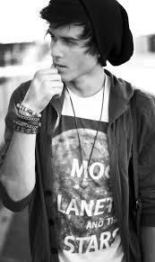
Bradley from London is your typical fun banter lad, he is currently at a college in his area studying art and photography, his part time job he helps out on sets for photoshoots getting the stars ready. He loves music and photography, its his main passion - every concert and gig his faviourte stars perform at he is there without a doubt and ensures all his money is spent keeping up to date with his faviourtes, not only does Bradley follow them all on online media through twitter, tumblr but he buys weekly magazines to feel in touch with the artist themselves.

He has a unique style and dosent seem to follow the crowd, he likes all the typical hats boys wear with tight jeans and baggy tops. He mainly shops in shops such as topman and urban outfitters as he beleives highstreet fashion is much better than paying top prices for the same clothing. He has an ultimate obession with shoes too, air max and vans are by far his fave.


Magazine ideas

For my magazine I think I would like to include a picture collage such as this, the black and white theme of different colours and angles has a really professional feel to it.

Evaluation

Evaluation of my Pleminary task –

I have now completed my Haydon magazine task – my actual magazine compared to the original design is quite different, I didn’t include all the sell-lines and images I originally thought I was going to and in the end made it a lot more simple than I originally planned to as I feel this look more professional and suitable to the target audience of teenagers at Haydon school. However I am happy with my final design as I followed the same layout and colour scheme I originally intended on.

Front cover
My front cover includes a main image of David holding a football with the background in St Mary’s hall, the reasoning behind this was as holding the football displayed that my magazine was about sport, him smiling in the photo empathises the fun and happiness he shares within the PE department at school which is what I wanted to achieve, I feel the image used was appropriate to my magazine as it conveyed what my magazine was about and gave the viewers an inside to how successful the PE department is. The colour scheme throughout of white with Haydon’s own blue worked well together as they complimented each other ensuring the magazine looked professional. I choose a simple font of Arial as it was bold and clear for the viewers to read. I included a variety of images to make it more interesting to look at rather than it being full of writing.

Sell lines
The sell lines I included suggested to the viewer what was inside the magazine which I believe was successful as they was able to know exactly what was inside so if they was interested about that topic they’d know, I complemented the images with a sell line to ensure they knew what I was trying to express through my photo. Haydon is full of teenagers who are all engaged to social media so I thought by displaying an element of social media on the front cover would attract the students into reading the magazine, this is a way of gaining more readers and providing the wants and needs of my audience creating a personal relationship with them as they feel understood. I varied the font colours/backgrounds on them to make it more interesting and to display the highlighted text was more important than the non-highlighted text.

Contents page
My contents page followed the same colour scheme as my front cover to give my magazine a professional and effective look. I included a 'welcome' section to make my readers feel like they are involved in something and not just reading any magazine. Carrying through the same colour scheme suggests I understand the ‘house style’ of my magazine and that I’ve kept it looking professional and avoided it looking tacky. I wrote the page numbers next to the description and title of each feature to allow the reader to skip to whichever feature interests them most. I included one main image on the contents page as I didn’t want to fill it up to much, I thought keeping it simple would look more professional as it’s only the contents page.

What would I do better?
Next time making a magazine id ensure I don’t use an iPhone to take the images as they came out quite fuzzy and didn’t look as professional as they would if I used a professional camera. I’d use a wider variety of images on the contents page and include more of the page numbers so that they didn’t have to flick through the magazine finding what they wanted. I would also add more text to the front cover as it doesn’t have much detail to it.